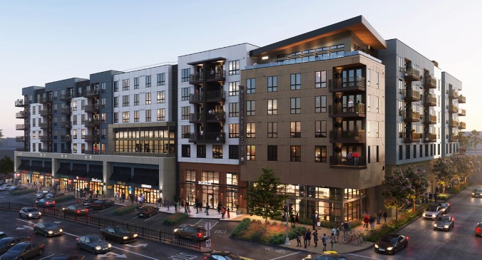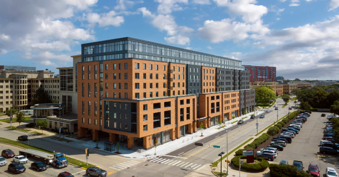
Lamar Johnson Collaborative (LJC) announces the recent completion of Chapter Madison, a 10-story, 550-bed student housing development designed by the firm to address the need for campus-adjacent living at the University of Wisconsin – Madison and anchor a prominent corner at 832 Regent Street in the city’s historic Greenbush neighborhood.
Because Chapter Madison is situated on a highly visible but oddly shaped piece of land, comparable to an angled wedge with a jagged edge, the project developer, CRG, initiated a lengthy design process in the attempt to close the gap between the needs and preferences of the surrounding community and the financial viability of the development. Initially involved in the project in a consulting role, LJC Principal Alan Barker and a team of residential designers devised creative approaches that fulfilled neighborhood zoning guidelines while maintaining the mix and number of units necessary for the building’s return on investment.
“Chapter Madison stands on a very prominent site that had been underutilized for quite some time, so the community understandably set the bar high for what would be built there,” said Barker. “Our solution was rooted in working at three different scales – the neighborhood scale, the streetscape scale and the human scale – in order to break down what would have been a giant façade into one that integrates well with its surroundings.”
To achieve that, the design includes building setbacks at the fourth and eighth floors, enhancing the natural light while minimizing the building’s presence from the wider, newly landscaped sidewalks. On bustling Regent Street, a vibrant mural by artist Amy Zaremba pays homage to Greenbush in depicting historic scenes from the neighborhood, including the nearby Italian Workmen’s Club, one of the oldest active Italian clubs in the U.S. At each end of the building, a covered entry and terrace emphasizes prominence at their respective intersections.
Vertical black metal panels running from ground level to the rooftop similarly break down the building’s massing into visually distinct sections evocative of the area’s existing architecture. Metal architectural elements contrast the masonry façade, with gray metal accenting the light reddish brick and wood-effect panels highlighting the darker charcoal brick.
“The team focused on breaking down the long façade into manageable pieces while creating a visually striking building that is forward-looking without standing out in a showy way,” said Veronica Widholm, project architect at LJC, pointing to the more contemporary covered entry and terrace that defines each end of the building. “For the façade, our design approach relied on richness through reduction and careful application of materials. The use of classic materials like brick and metal is elegant yet understated and gives the building a feeling of permanence.”
“We also needed to think differently about how to ensure we were meeting the project proforma,” added Barker. This was accomplished with a unit mix that placed four- and five-bedroom units on the lower floors where larger floor plans could be more easily accommodated and smaller units that take advantage of views on upper floors. The penthouse level features a number of amenities where residents can enjoy the cityscape vistas.


