RealPage recently held a webinar where they discussed the differences between the recent performance and the future prospects of the urban core apartment markets compared to the more suburban markets.
Inspiration for this webcast came from the widespread recent speculation that the COVID-19 pandemic had disproportionately impacted properties in the urban core. The presentation was conducted by Greg Willett, Chief Economist at RealPage and Adam Couch, Market Analyst at RealPage.
Defining terms
For purposes of this analysis, RealPage defined “urban” areas to be densely populated and highly developed areas around the central business districts of major cities. The “suburban” areas are more affordable and less densely populated areas outside the urban core. However, “suburban” areas may still be within the city limits.
Tracking occupancy
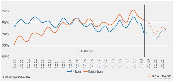
RealPage presented information on occupancy dating back to 2011. It showed that occupancy in urban properties was significantly higher than that in suburban properties at the beginning of the period. However, urban occupancy remained at about the same level, with seasonal variations, while suburban occupancy rose. Starting around 2015, suburban occupancy exceeded that in urban areas, a trend that is still in place today.
Although occupancy has fallen in both urban and suburban areas since the pandemic started, the impact has been more pronounced in the urban areas. This is shown in the first chart from the webinar, below.
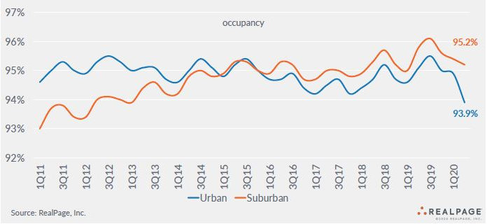
While the chart shows the overall occupancy difference between the two regions, the occupancy difference varies by apartment class. Suburban class A and B apartments achieve higher occupancies than their urban core counterparts, but urban class C apartments actually have higher occupancy than their suburban equivalents. However, the higher prices of urban apartments mean that there are fewer class C apartments available there than in the suburbs, so the overall average occupancy for the suburbs remains higher.
Urban flight
Despite reports of people fleeing the urban core, RealPage’s analysis indicates that this is not generally true. Much of the loss in occupancy being seen is the result of young people who are experiencing unemployment moving in with their parents or with roommates. Therefore, the fall that is being observed in occupancy is not so much due to households relocating as it is to the number of rental households decreasing.
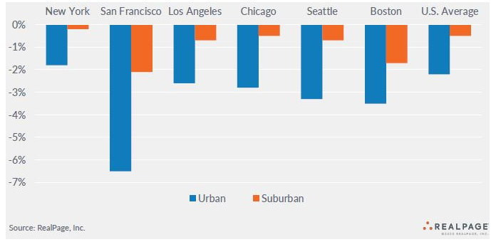
While urban flight may be overstated in general, there are metro areas where it is taking place. RealPage identifies these as expensive gateway metros. The second chart, below, identifies several of them and illustrates the extent of their occupancy losses.
Tracking pricing
In addition to occupancy, pricing changes are a key metric to examine in assessing the disparate impact of the pandemic on urban versus suburban apartment markets. RealPage presented the next chart showing the long term trends in annual changes in effective asking rents for new leases for both markets.
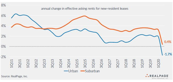
The chart shows that rent growth has been stronger in suburban areas than in urban areas since 2013. While rent growth has fallen in both areas recently, overall rent growth has remained positive in suburban areas while it has fallen to -1.7 percent in urban areas.
Despite the years of higher rent growth in suburban areas, absolute rents remain higher in the urban apartment markets. RealPage estimated the average rent for an urban apartment at $1,955 per month while the average rent for a suburban apartment was estimated at $1,349 per month.
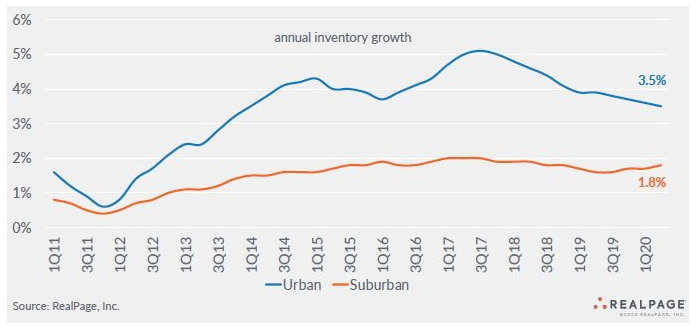
One key to the higher rent growth of suburban area apartments is illustrated in the next chart. It shows the average annual inventory growth rates in the two regions. The much higher inventory growth rate for apartments in the urban core since 2012 has been a factor in dampening rent growth in those markets and in keeping occupancy lower than in suburban apartment markets.
Looking ahead
The next chart is the most surprising of the presentation. It depicts the shares of total apartment demand supplied by the urban and suburban markets. The chart shows that the suburban apartment market is much larger than is the urban apartment market. In 2011, over 80 percent of apartment demand was provided by the suburban apartment market. In recent years, that share has fallen to around 75 percent.
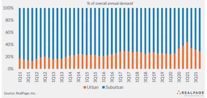
While the bars in this chart always add to 100 percent, the actual total number of units being absorbed quarter by quarter could be substantially different. These figures were not provided as part of the presentation.
The chart provides a projection of future demand. It predicts that the share of total demand being supplied by the urban apartment market will rise significantly during the quarter we are now completing and during the next two quarters. This is a little surprising since the attractions of the urban environment: the clubs, restaurants, bars and entertainment, continue to be impacted by COVID-19 related shutdowns.
The next chart projects how occupancy will change through the end of 2021. It is consistent with the previous chart in that it shows occupancy rising in the urban apartment markets over the next two quarters while it continues to fall in the suburban markets. By 2021, it shows apartment occupancy returning to its usual annual cycle, albeit at lower levels of occupancy than in the recent past.
The final chart projects how rent growth will change through the end of 2021. It predicts that the worst is yet to come for rental housing providers, with rent growth in both urban and suburban markets turning negative by the first quarter of 2021. It does not project overall rents to increase until some time in 2022.

The webcast went on to describe several specific suburban markets. It can be viewed here.


