

The latest rent report from Apartment List shows positive rent growth for the country as-a-whole and for 48 of the top 50 metro areas.
Rents rebound strongly in March
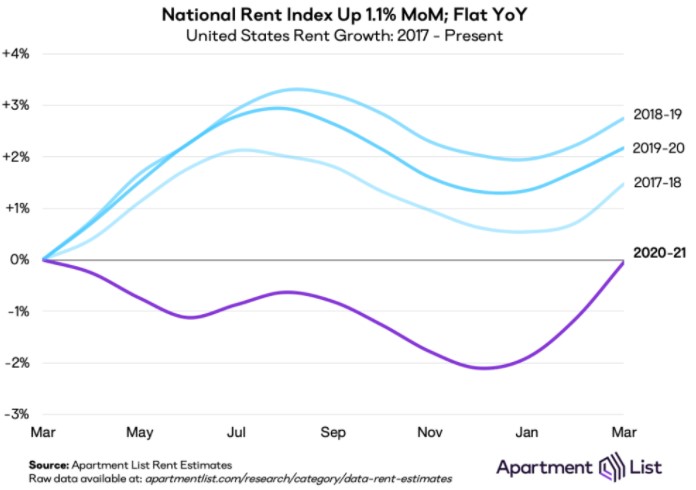
Apartment List reported that the national average rent rose 1.1 percent for the month of March, the highest monthly increase they have seen in the 4 years that they have been reporting data. The national average rent was effectively unchanged when compared to its year-earlier level, the first time in a year that it has not been down.
In a “normal” year, March is early in the leasing season and rents increase during the month. This year, this effect has been accentuated by the fact that rents have been depressed for the past 12 months. This is show in the first chart, below, reproduced from the Apartment List report. The chart shows the March-to-March pattern of changes in the national average rent over the past 4 years.
Part of the reason for the relatively strong rent growth performance seen in March is that rents have started to rise in the cities where they had been falling, such as San Francisco and New York. At the same time, rents have continued to rise in cities that have had rising rents despite the pandemic, such as Boise and Riverside.
Core versus metro
Apartment List provides the underlying data they collected in compiling their report and that data was used to create the tables, below. The tables look at the 50 largest metro areas by population and identify the top 10 metros for year-over-year rent increases and the bottom 10 metros for year-over-year rent decreases. The tables provide the year-over-year percentage change in rent (YoY Metro) along with the percentage change from the prior month’s rent level (MoM Metro). They also list the year-over-year percentage change in rent for the core city in each metro area (YoY Core).
The first table shows the 10 metros with the largest annual rent decreases. For most of the metros, the rent drop in the core city of the metro area greatly exceeded that of the metro area as-a-whole. This is consistent with reports that renters have been fleeing the urban core for suburbs or exurbs. The exception to the rule is San Jose, which is a city characterized by sprawl. It does not have a significant downtown the way that San Francisco or New York does, so there is less of an urban core to flee from.
The other thing to note from this chart is that most of these metro areas experienced strong rent growth during the month. Even the 0.5 percent monthly rent growth in the slowest growing metro, Los Angeles, would be considered healthy in a normal year.
| Metro | YoY Metro | MoM Metro | YoY Core |
| San Jose | -15.6 | 0.8 | -13.6 |
| San Francisco | -14.7 | 1.0 | -23.2 |
| Seattle | -10.6 | 2.1 | -18.6 |
| Boston | -8.1 | 2.6 | -14.5 |
| New York | -7.0 | 1.7 | -18.7 |
| Washington DC | -6.5 | 1.2 | -13.3 |
| Chicago | -4.8 | 1.7 | -10.2 |
| Minneapolis | -4.6 | 1.2 | -10.0 |
| Los Angeles | -3.6 | 0.5 | -7.9 |
| Orlando | -1.8 | 1.3 | -2.5 |
The major metros with the largest year-over-year rent increases are listed in the next table, below. The archetype for strong performance during the pandemic, Boise, is not listed because it is not a top 50 metro by population.
As with the metros listed in the first table, the metro areas listed below generally outperform the core cities contained within them. However, the difference in performance between the core city and the metro as-a-whole is much smaller for the top metros by year-over-year rent growth listed below than it is for the bottom metros by year-over-year rent growth listed above.
The spread in the rates of month-over-month rent growth for the metros with the strongest annual rent growth is smaller than for the metros listed in the first table. However, the rates of month-over-month rent growth listed would be considered to be healthy in any year.
| Metro | YoY Metro | MoM Metro | YoY Core |
| Inland Empire | 12.9 | 1.7 | 8.9 |
| Memphis | 8.8 | 0.6 | 8.5 |
| Sacramento | 7.9 | 1.1 | 4.8 |
| Buffalo | 7.7 | 1.8 | N/A |
| Virginia Beach | 7.0 | 1.1 | 7.8 |
| Richmond | 6.5 | 0.8 | 5.5 |
| Las Vegas | 6.4 | 1.0 | 6.4 |
| Phoenix | 6.3 | 1.2 | 5.6 |
| Tampa | 5.7 | 1.2 | 5.7 |
| Jacksonville | 4.8 | 1.1 | 4.7 |
*Riverside-San Bernardino-Ontario
Coming together
The Apartment List report notes that the cities that have shown the highest rent growth during the pandemic are generally the cities that had the lowest rents when the pandemic started. Conversely, the cities with the greatest rent declines are generally the cities with the highest rents going into the pandemic. These changes have caused rents to converge across the country, although significant differences in rent levels still remain.
The complete Apartment List report covers many more metros and contains some interesting charts illustrating how rents have changed over time in the hardest hit markets. It also provides readers with the opportunity to download their data sets. It can be found here.


