

The latest rent report from Apartment List shows strongly positive rent growth for the country as-a-whole. In addition, rents were up for the month in all of the 50 largest metro areas.
Rents surge higher in May
Apartment List reported that the national average month-over-month rent growth reached 2.3 percent in May, once again the highest monthly increase they have seen in the 4 years that they have been reporting data. The national average rent growth was 5.3 percent year-over-year, also a record.
The first chart, below, shows the history of the national average rent since 2017. This is the period in which Apartment List has been compiling this data. The chart shows that rents generally rise in the spring through summer before declining in the fall and winter. However, in recent years, rent growth has been consistently positive on a year-over-year basis. That is until COVID hit.
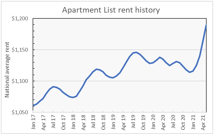
The chart shows that 2020 began with the same pattern as in years past but rent growth turned negative in the spring before rebounding somewhat in the summer. Rents fell in the winter as usual. However, rent growth has been unprecedently strong in the last few months.
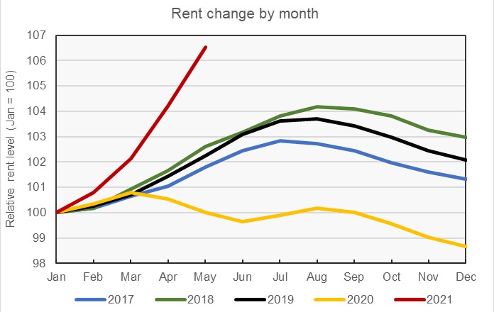
The second chart, below, shows the annual pattern of rent growth for the years for which Apartment List has data. In each year, the level of rent in January of that year is set to a value of 100, so that the differences in the rates of rent growth throughout the year from one year to the next are more apparent. The chart makes clear how different the rent growth patterns in the years 2020 and 2021 are from those of the three preceding years. While rent growth stumbled its way through 2020, it has taken off like a rocket in 2021.
Core versus metro
Apartment List provides the underlying data they collected in compiling their report and that data was used to create the tables, below. The tables look at the 50 largest metropolitan statistical areas by population as defined by the US Census Bureau and identify the top 10 metros for year-over-year rent increases and the bottom 10 metros for year-over-year rent decreases. The tables provide the annual percentage change in rent (YoY Metro) along with the percentage change from the prior month’s rent level (MoM Metro). They also list the year-over-year percentage change in rent for the core city in each metro area (YoY Core).
The first table shows the 10 metros with the largest annual rent decreases. For most of the metros, the rent drop in the core city of the metro area greatly exceeds that of the metro area as-a-whole. This is consistent with reports that renters have been fleeing the urban core for suburbs or exurbs. The other thing to note from this chart is that all of these metro areas experienced strong rent growth during the month.
| Metro | YoY Metro | MoM Metro | YoY Core |
| San Jose | -9.2 | 2.2 | -8.0 |
| San Francisco | -8.3 | 2.2 | -14.3 |
| Seattle | -2.8 | 3.3 | -9.8 |
| Washington DC | -1.6 | 2.5 | -7.8 |
| New York | -1.4 | 2.5 | -10.2 |
| Boston | 0.2 | 3.8 | -4.0 |
| Minneapolis | 0.6 | 2.1 | -4.4 |
| Chicago | 1.5 | 3.2 | -2.0 |
| Los Angeles | 1.9 | 1.5 | -2.2 |
| Houston | 2.6 | 1.9 | -1.5 |
There are metros with much bigger losses in rent levels than those listed in the table above, but they are smaller metros, so they did not make the list. The three showing the greatest drops in rent are the oil-patch metros of Odessa, Tex. (-24.6 percent), Williston, N. Dak. (-20.4 percent) and Midland, Tex. (-16.9 percent).
The major metros with the largest year-over-year rent increases are listed in the next table, below. The archetype for strong performance during the pandemic, Boise, is not listed because it is not a top 50 metro by population. However, for reference, its year-over-year rent growth hit 29.9 percent in May.
The metros listed in this table are generally centered around smaller cities than are the metros listed in the table above. This may account for their core cities doing relatively well.
| Metro | YoY Metro | MoM Metro | YoY Core |
| Inland Empire | 20.2 | 2.6 | 12.7 |
| Rochester, NY | 16.6 | 2.8 | 12.8 |
| Sacramento | 14.4 | 2.6 | 10.3 |
| Las Vegas | 14.3 | 2.7 | 13.5 |
| Phoenix | 14.3 | 2.8 | 12.6 |
| Tampa | 14.1 | 3.5 | 14.5 |
| Memphis | 13.3 | 2.5 | 12.4 |
| Virginia Beach | 12.6 | 2.5 | 16.4 |
| Jacksonville | 11.8 | 3.1 | 11.2 |
| Atlanta | 11.1 | 2.5 | 6.9 |
*Riverside-San Bernardino-Ontario
The complete Apartment List report covers many more metros and contains some interesting charts illustrating how rents have changed over time in the hardest hit markets. It also provides readers with the opportunity to download their data sets. It can be found here.


