The Bureau of Labor Statistics (BLS) recently released its report: Consumer Expenditures in 2016. It contains estimates of both income and spending by category. Analysis of the data it provides gives a different perspective on housing affordability.
Discussions of housing affordability usually focus on the portion of a renter’s income devoted to housing. However, a phenomenon which has long been observed for low income people is that their spending exceeds their reported income. According to the BLS report, it exceeds it by quite a lot.
The BLS report looks at people as members of consumer units (CUs). A CU may be a family, a single person sharing lodging but remaining financially independent or it may be unrelated people living together who share finances. Every CU has a reference person who is defined as the one who owns or rents the home. The BLS reports the data on consumer units in a number of ways, but this study looks the report by income decile (10 percent of the CUs).
Income, spending and shelter expense
The first chart illustrates the disparity between income and spending for CUs in the lowest 5 income categories. While the survey data is an average for all CUs, both renters and homeowners, the average rent paid by CUs who rent was calculated and is represented by the blue line in the chart. The yellow line adds utility costs to the rent and represents the major expenses of procuring shelter.
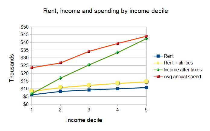
The green line represents the after-tax income of the CU. It includes wages and salaries; self-employment income; Social Security and other retirement plan income; interest, dividends and rental income; public assistance, SSI and SNAP; unemployment and workers’ compensation; and other income. It also adds in the impact of personal taxes which, on average, give money back to the CUs in the lowest three income groups.
The red line represents the actual spending reported by the CUs. The huge gap between the income reported by the CUs and their reported spending is not explained by the data gathered by the BLS. However, the following table lists some other factors reported by the BLS which may provide a partial explanation.
|
Item |
Lowest |
Second |
Third |
Fourth |
Fifth |
|
Net change in total assets |
1,708 |
1,419 |
5,698 |
4,865 |
10,872 |
|
Net change in total liabilities |
1,638 |
1,552 |
2,876 |
3,694 |
4,261 |
|
Other money receipts |
450 |
507 |
415 |
910 |
781 |
|
Gifts of goods and services |
287 |
460 |
728 |
603 |
836 |
That there is an increase in total assets, on average, shows that some CUs, even in the lowest income group are able to save. The BLS report does not specify how many of these CUs rent however. The relatively modest change in total liabilities for the lower income groups compared to the income-to-spending gap shows that they are not filling the gap with borrowing, at least not completely. Gifts and miscellaneous money receipts also don’t seem to explain their ability to spend much more than they earn.
Regardless of how the gap between income and spending is being filled, looking at spending on shelter compared to total spending rather than compared to total income gives a very different picture of housing cost burden. This is illustrated in the following chart.
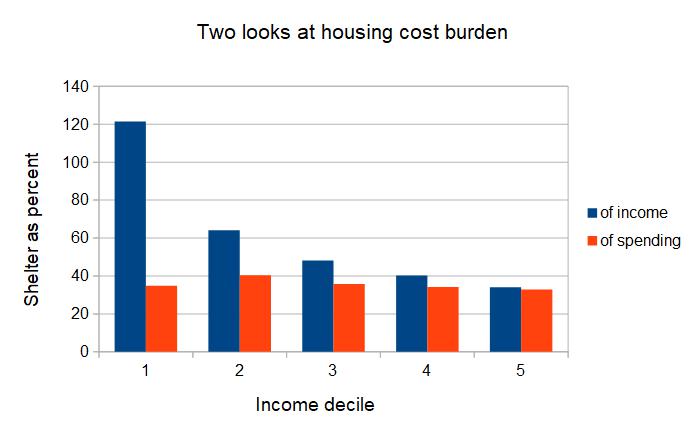
When compared to total reported income, the housing cost burden is impossibly high for the two lowest income groups. When compared to the total spending of these groups, it is still high, but not impossibly so. Understanding how CUs fill the income-to-spending gap is key to knowing which measure, reported income or reported spending, is a better basis for evaluating housing cost burden. However, to date, we have not found a study that explains this gap.
We will keep looking.


